Ask what one decision or action each screen should support at its exact point in the journey.
Screen role playbook
One Screen, Too Many Jobs: A Menu Board Role Playbook
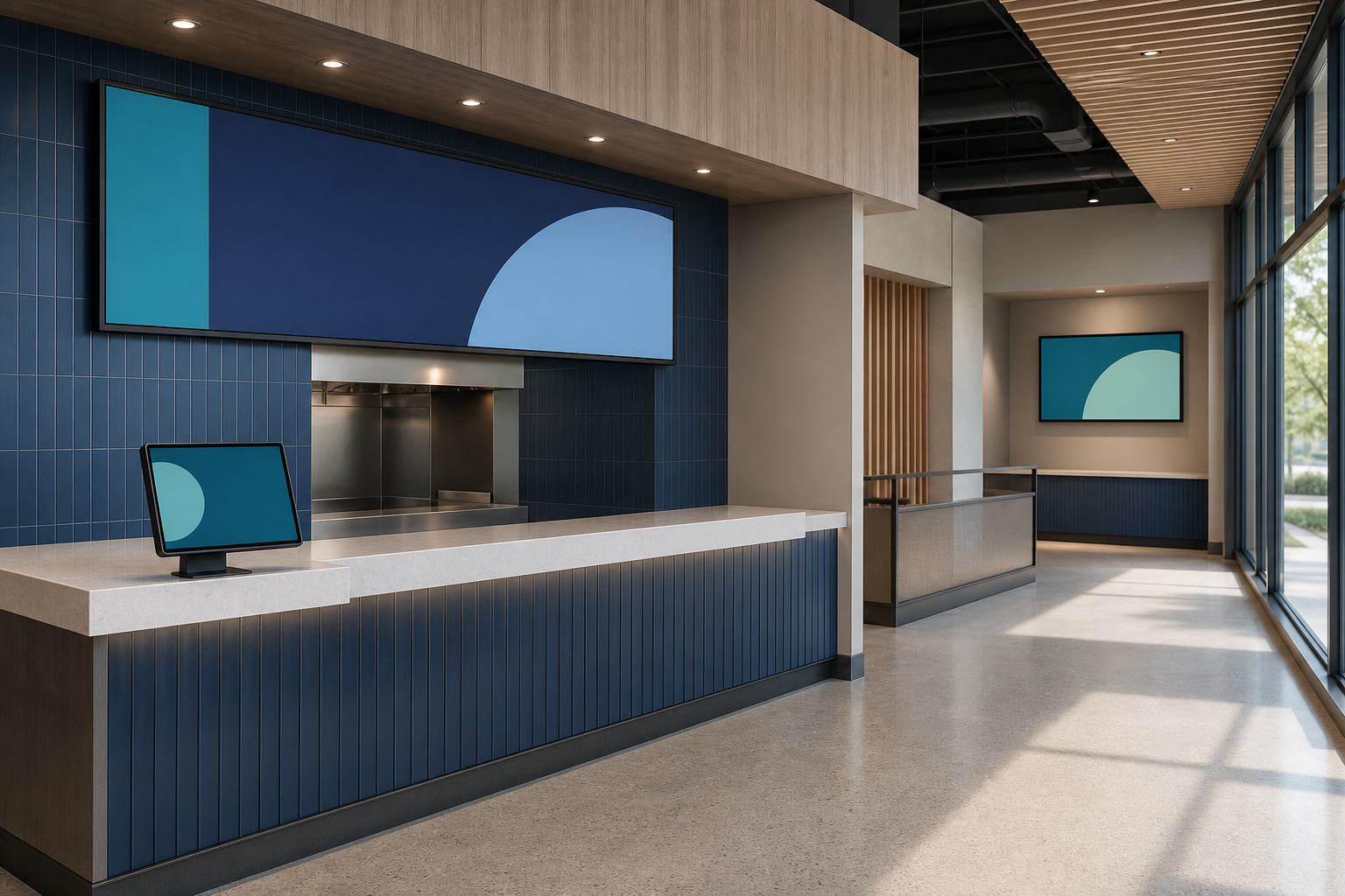
A digital menu board can be technically perfect and still make the service experience harder. The usual problem is not the panel. It is the number of jobs assigned to it.
One screen is asked to introduce the offer, list every item, explain modifiers, promote an add-on, confirm availability, show an order status, and carry a brand campaign. When everything is important, the guest has to wait for the right slide—or ask a team member to translate the screen.
Recent industry discussion makes this a timely operating question. A July 20 invidis analysis described restaurant ordering journeys fragmenting across apps, kiosks, drive-thrus, and counters. Its central observation was that digital menu boards are becoming a network of specialized screens rather than one display above the register.
A July 8 update from Kitcast Research also showed different content mixes across restaurant and quick-service screens. Kitcast says its results combine first-party fleet telemetry with a 515-operator survey and a scan of more than 10,000 displays; because the company sells signage software, those figures are best treated as directional vendor research, not a universal benchmark.
For a broader systems view, review the ServingIntel integrated operations platform.
The practical lesson is simple: begin with screen roles, not screen count.
Give every display one primary job
A screen can support several messages, but it should have one primary job that a guest or staff member can explain in a sentence. Start by walking the service journey and identifying the decision that belongs at each point.
1. The approach screen: help people orient
An approach screen is visible before a guest reaches the ordering point. Its job is discovery, not detail. It can establish the available service path, introduce a limited-time offer, or help someone choose the right line.
Keep the message stable long enough to read while walking. If the screen rotates, the core orientation information should remain available rather than disappearing behind a campaign. The test is not whether the animation looks polished from a desk; it is whether a first-time guest knows what to do next without stopping traffic.
For neutral background and operating context, see AVIXA audiovisual-industry resources.
2. The decision screen: make the choice legible
The decision screen belongs where a person compares items, prices, or options. It may be an overhead menu board, a counter-level display, or a kiosk-adjacent panel. Its job is to reduce the effort of choosing.
Give persistent space to the information required for a decision. Use hierarchy to separate categories, prices, modifiers, and unavailable items. Avoid forcing a guest to remember one slide while waiting for another. If important content must rotate, provide another stable route to the complete menu.
The right content density depends on viewing distance and dwell time. A large overhead board can support scanning across categories. A smaller counter display can clarify the final choice, surface an appropriate add-on, or explain a modifier at the moment it becomes relevant.
3. The transaction screen: confirm what the system knows
A customer-facing POS display or kiosk confirmation view has a narrower job: show what is about to be purchased. It should help the guest catch an incorrect item, quantity, modifier, or price before payment.
Related infrastructure planning is available in ServingIntel POS hardware guidance.
Treat confirmation as an operational control, not spare advertising space. Promotions should never obscure the order state. If pricing or availability comes from the POS, document the update path and the fallback behavior. Teams evaluating that connection can use a broader review of senior living POS software to frame questions about data ownership, permissions, and synchronization—even when the immediate use case is a restaurant counter.
4. The handoff screen: reduce pickup uncertainty
After payment, the guest has a different question: where is the order, and what happens next? A pickup display should answer that question without exposing unnecessary personal information or competing with unrelated promotions.
Choose status language that matches the real kitchen or service workflow. Do not create five digital states if the team can reliably support only three. Decide what the screen shows during a system interruption and how staff can switch to the fallback. The goal is fewer repeated status questions, not a more elaborate animation.
5. The service screen: communicate beyond the transaction
Lobby, dining-room, and community displays can carry broader information: hours, events, service changes, education, or atmosphere. These screens may be especially useful in senior living dining, where the audience, viewing distance, and need for stable information differ from a quick-service queue.
A complementary portfolio perspective is available in the POS Menu Boards screen-update drill.
Separate this role from the transaction path. A message that works in a seated dining area may be too detailed for a counter. A promotion designed for a brief queue may feel noisy in a resident community. Shared templates can preserve visual consistency, but the content schedule should respect the purpose of each location.
Build a screen-role card before designing content
For each display or display group, create a one-page role card. It should be short enough for operations, marketing, and technology teams to review together.
- Primary audience: Who can see the screen, and what are they doing at that moment?
- Primary job: What one decision or action should the screen support?
- Viewing conditions: Distance, dwell time, lighting, angle, sound, and accessibility needs.
- Authoritative data: Which system owns prices, availability, order status, hours, or event details?
- Content owner: Who requests, checks, approves, publishes, and retires a message?
- Fallback: What should appear when a feed, player, network, or screen is unavailable?
- Success measure: Which observable behavior or operating result would show that the screen is helping?
This role card also improves vendor conversations. Instead of asking for “three menu boards,” an operator can describe three outcomes, three data relationships, and three sets of environmental requirements. A review of POS hardware options can then focus on serviceability, mounting, brightness, connectivity, and lifecycle needs rather than specifications in isolation.
Design a sequence, not three separate campaigns
Specialized screens should not become disconnected islands. Sketch the information sequence from approach to decision, transaction, and handoff.
Use the following resource when assigning escalation and recovery ownership: ServingIntel support resources.
First, remove unnecessary repetition. The approach screen may introduce an offer, while the decision screen supplies the price and choice details. The transaction screen confirms the selected item. The handoff screen should not restart the sales pitch while someone is looking for an order.
Second, protect the persistent layer. Essential information—core categories, current price, order state, or a service instruction—should not vanish simply because promotional content rotates. The July 6 Reddit discussion retained in this package is not factual authority, but its comments are a useful audience signal: people repeatedly complained about menu content disappearing mid-read, poor image fitting, and update processes that staff could not control.
Third, define the exception path. What happens when an item sells out, a price changes, a daypart runs late, or an order-status feed stops? A digital screen is most valuable when the team can make a correct change quickly. If the workflow requires a person who is unavailable, the display program has an ownership problem rather than a graphics problem.
For additional independent reference material, review NIST Cybersecurity Framework.
Avoid four common role conflicts
The menu-versus-ad conflict
If a guest is actively choosing, the menu should not disappear behind a full-screen promotion. Reserve promotional space that does not interrupt the primary decision, or place campaign content earlier in the journey.
The central-versus-local conflict
Central control protects standards, but local teams often see availability and service changes first. Define which fields are centrally locked, which can be changed locally, and which require approval. Log the change so the organization can learn without losing accountability.
The real-time-versus-reliable conflict
A live integration is useful only if its source, refresh frequency, failure state, and support owner are understood. Do not label a feed “real time” when the operating team cannot explain when it last updated. When support responsibilities cross systems, technology support planning should include a clear first contact and escalation path.
The consistency-versus-context conflict
Consistency does not require every screen to be identical. Use a shared design system—type scale, contrast rules, approved components, and content governance—while allowing each screen to do its assigned job.
For another practical workflow in the portfolio, read the POS Websites integration questions.
Pilot the roles with operational questions
Before expanding the network, observe one location across a representative service period. Ask:
- Can a guest identify the next step before reaching the counter?
- Does required decision information remain visible long enough to use?
- Can the transaction screen reveal a mistake before payment?
- Does the handoff screen reduce repeated order-status questions?
- Can staff report and correct inaccurate content through a known path?
- Does each screen have a fallback that the team has actually tested?
- Can the operator name one measure tied to each screen’s primary job?
Useful measures may include fewer menu-clarification questions, fewer corrections after payment, shorter perceived pickup uncertainty, faster removal of unavailable items, fewer emergency content requests, or better staff confidence in the update process. Sales outcomes can matter, but they should not be the only evidence. A screen that improves clarity and reduces avoidable service friction may be doing valuable work even when attribution is imperfect.
Start with purpose, then choose the screen
The strongest digital display program is not necessarily the one with the most panels or the busiest content calendar. It is the one where every display has a clear audience, a defined job, an accountable owner, and a tested fallback.
Map the journey. Assign the roles. Protect the information people need at each moment. Then select hardware, software, layouts, and campaigns that serve those roles.
For additional restaurant and senior-living technology context, consult ServingIntel News & Insights.
That turns a collection of screens into a coherent service system.
Evidence used for this guide
- QSR: Digital Menus, New Rules — invidis, July 20, 2026
- Restaurant Digital Signage: 2026 Statistics — Kitcast Research, updated July 8, 2026
- Audience discussion signal — Reddit, July 6, 2026
Keep required menu, price, order, or service information available instead of hiding it behind a rotating campaign.
Name who requests, verifies, approves, publishes, retires, and fixes every important content type.
For a final neutral reference point, consult CISA Secure by Design guidance.
Test what guests and staff will see when a data feed, player, network, or display is unavailable.
Related resources
Connect display roles to the operating systemA useful screen plan considers the dining workflow, data source, hardware lifecycle, and support path together.
- Senior living dining workflows
- Senior living POS software
- POS hardware options
- ServingIntel News & Insights